design (105)

Diwali - festival of lights

It is an ancient Hindu festival which is celebrated at a global in autumn every year. This infographics enumerates the significance of the festival and the preparations and rituals surrounding it. Diwali is usually associated with house decoration, cleanliness and renovations, new clothes, lighting of lamps, fireworks and crackers, family worships, exchange of gifts and sweets and family feasts. It is a one of the major festivals in India and 3rd largest celebrated festival in the world.

5520175864?profile=original


Its celebration includes millions of lights shining on housetops, doors and windows, around temples and other buildings. In India, it is one of the biggest shopping seasons. This festival is celebrated by all but significant for Hindus, Jains and Sikhs, with each having their own religious significance. Diwali is also a festival of sounds and sights with fireworks and rangoli designs, the festival is a major celebration of flavors with feasts and numerous sweets and savors, as well as a festival of emotions where Diwali ritually brings family and friends together every year.

Read more…

Halloween Facts and History

This infographic here represents the Halloween – A western festival celebrated annually dedicated to remembering of the dead, including saints (hallows), martyrs, and all the faithful departed believers. The infographic depicts some of the rare fun facts and figure associated with this Christian feast. The theme of the Halloween festival revolves around using "humor and ridicule to confront the power of death”.
 
Typical festive Halloween activities include trick-or-treating , attending costume parties, decorating and carving pumpkins into jack-o'-lanterns, lighting bonfires, apple bobbing, visiting haunted house attractions, playing pranks, telling scary stories, and watching horror films. It also includes attending church services and lighting of candles on the graves of the dead, the tradition of eating certain vegetarian foods for this vigil day, including the consumption of apples, col-cannon, cider, potato pancakes, and soul cakes are observed as a part of this feast.
5520174700?profile=original
Read more…

Web Design - Primary Guideline to note

Web design India is quick becoming along the same lines of the online cyber globe. Every company, company, business, and even individual desires to have a profiting web existence on the World Extensive Web. This is only possible through the development of a efficient website. There are several processes involved in web design. You need to concentrate on certain tips that can help you succeed in developing the best website. Let's take a look at the following factors.

• The Material of the website must be compelling

When designing a website, the submissions are very essential. Actually, that's the center factor of the entire procedure. You need to provide compelling content that can keep your guests coming returning. You must have something of value to provide through the website. If you're going to be selling items or services, you need to make commensurate content that will let individuals know what you're up to. It's always essential to engage a outstanding content company  http://www.bestwebdesignindia.net/ to provide you the right content for the website.

• Use Simple graphics, written text and other elements

In web design, simplicity is the key. There are millions of websites these days. All of them are jostling for area on the World Extensive Web. Web guests are always in a hurry to locate the details they are seeking for. If you make website too large with plenty of graphics and pictures, it's going to be very slowly to fill when someone visits. This can make guests to hit the close button and move on to the next available website. However, you'll always enjoy daily visits if your website is very easy to get around. You must prevent sleazy components, large graphics, large pictures and large texts if you truly want the best of web design. This will make your website to look cute and easy. You shouldn't distract your guests with animated GIFs, Scrolling written text, animations and other large graphics. Just keep everything simple! Your website will always fill quicker if you use lesser and easy components.

• Minimize Clicking

There's the need to minimize clicking in the website you're planning to style. There's no need to consist of several links in every line of the content. This can be very boring to guests. It's essential you add a weblink to the homepage on every web page. This allows the guests to backlink to the homepage without cracking their brain.

• Include Menu on Every Page

It's very essential to consist of "menu" on every single web page during the designing procedure. This allows the website guests to get returning to the homepage very quickly. The menu also allows guests to get around through the website quickly.

• Avoid Using Frames

When designing your website, it's outstanding you prevent using frames on any of the webpages. You should not use frames on the pictures you'll be inserting. The use of frames can actually clog your website and also make it very slowly in loading. You need to prevent it at all costs.

• Compress Image Files

Heavy picture data files can slowly down your website during the loading procedure. This can be very annoying to your web guests. To prevent this, you have to compress all the picture data files you'll be inserting on the website. You can compress them down to 20k. The creates your website very easy to fill at all periods.

In all, web design is a very elaborate procedure. If you can't handle it on your own, you need to engage an professional to help you out.

Read more…

5 Must-Try Online Tools for Graphic Design

Graphic Design becomes a competitive industry. And almost a lot of people are interested in learning this thing. It is because of the popularity of internet that makes this career grow. If you are one of the inspiring artists who wants to land a job in graphic design, here are some training tools that you can use to develop your skills.

1. DeviantART Community

If you are just a starting graphic designer, you must visit DeviantART Community and look for what it can give you. This website is actually a community that rated as the highest online artist upload space. You can look at the total of 200 million artworks. People can create their art in this community and can easily save it. They can also share it with others. You can also buy artworks if you want. Generate and look for design inspiration with this site that is perfect for aspiring artists like you!

2. Visual.ly

If you want to create an original visual content for your website, business, or brand, you can go and use Visual.ly. With the help of this tool, you can have an astonishing visuals that you will need in just a few minutes. This online tool offers you an easy and simple way to function the plug and play approach.

5520167471?profile=original

3. The Amazing Adobe Creative Suite

Do you want to create a portfolio for your website? Well, this tool can help you a lot in assisting you to generate your own design. The Amazing Adobe Creative Suite can be of great help if you are looking for a website that is related to graphics, such as Encore, Dreamweaver, Photoshop, After Effects, etc. Using this can encourage you to develop the looks of your website.

4. FotoFlexer Image Editor

FotoFlexer is one of the ideal image editing tools that you must try when you are looking for a device that can guide you in editing graphics in all levels of artists from beginners to professionals. It features a lot of options where you can easily adjust the attributes of this tool based on your skills. You also have the choice if you want to share your work online.

5. Banner Fans

If you need a banner for your website, this online tool is what you are looking for. It is easy to use because it offers a ready-made banner and all you have to do is change the sample text and look at the preview if that is what you desire. Using this tool provides you to generate the fastest banner if you are in a limited time.

Internet has gone a long way. It has ups and downs. All you have to do is to get all the benefits that it offers. You can hone your creative skills in graphic designing with the use of these online tools. Capture the mind of your readers and viewers in creating visuals with the use of this great technology.

About the Author:

A book and movie lover. Naomi Witter is pursuing her career in Journalism. She is currently working as a freelance editor at bestessays.com.

Read more…

Web designers know how important color scheme in creating websites. No matter what business you have, choosing the perfect colors can improve your website to your advantage.

Colors have meaning and power. But based on a study by Whitfield, T. W and Whiltshire, T. J., the effect of a color varies from different people. This is because people see the elements of a color, like preferences, experiences and cultural differences, differently. Regardless colors are still seen as the most interesting and important part of marketing and branding.

If you want to optimize your website and create a consistent branding for your website, you have to be careful in choosing the colors for your site. Here are the tips you should consider:

Understand Branding

The colors in your site suggests what you are as a company. It also attracts certain customers or imply your company's goals. In a less murky explanation, marketers say that colors make a brand more recognizable. So picking a color different from your competitors, and the other well-known companies, helps you create a mark to your target.

A study published in Journal of Sensory Studies, found that consumers' reaction to colors in relation to a product is more important than the known meaning of a color. So if a businessman buys a laptop for work, he won't go with the pink model instead go for black or silver.

Always match the website color to your brand to make the branding consistent and reputable.

Know The Purpose of The Website

There are companies that deviate from their brand color to establish a whole different look for their website. This is because, they find the purpose of their website as different to what their brand is.

A website is a marketing tool and each tools have different target audience. So if your website targets investors other than the usual market, you might pick a more business like hue like gray, black or white.

Write down the goals of your website so you can easily choose which color can help you achieve that purposes. You can still create a consistent branding by using the same company logo, rush essay contents, and related images.

Identify the Graphics You'll Use

The images you use should match the colors of your website because there is nothing worse than bad color combination. Bad color scheme might imply a different tone to people, especially when companies rely on color combination to set their brand different from others. Just keep the majority of your site's colors easy to be partnered with other colors. Basic tones like white and black are perfect background hues because it does not affect the written text and readability.

Think About Functionality

Think whether the colors optimize the website and does not hinder the visitors in reading your content. Are the background colors too bright? Is the text color readable? Does the color makes the layout congested?

Think functionality, not just design. If the colors are difficult on the eye, your visitors can rebound out of your website. That is one possible customer you lost.

Seek Help From Professional Tools

If you still can't decide which colors to pick, you can check a few online tools used by professional web designers.

  • Adobe Color CC

This useful tool lets you mix up colors and design palettes. You can also use the color schemes made by other users to save time.

  • Color Schemer Online V2

In intensive color scheme generator that enables artists to check perfect palette for their web design.

  • Contrast-A

Contrast-A gives you WCAG-compliant color schemes. The tool previews different contrast levels to help people with color blindness, reduced vision and clinical blindness.

  • Paletton

This tool gives you an extensive color palette you can control through a color wheel. It makes your design process convenient by providing a sample site for the tones you picked.

  • Pictaculous

This amazing tool pulls out color scheme from images you upload. Meaning, you can upload your company logo and take colors from it to keep your brand consistent.

True, deciding which color scheme to choose for your website is difficult. It is not a simple matter because the success of your business relies on how well people see your website. Follow the tips above and your web design process will be easier.

About the author:

Lace Wanders is a writer for rushessay.com, a writing company that help students with academic projects, and private companies with the contents for their websites.
Read more…

Every Designer Should Know These Websites

If you are a graphic designer who is just starting his freelance career and making a single project takes you days, you better read along because this post is about to reveal the top secret art websites every designer should use.

Geometric Shapes:

In the past few years, along with the Metro Style, there has been a new trend on the visual market covering all spheres of the art world. 

29-websites-with-extraordinary-geometry-elements.jpg?width=550

From fashion to pure hand-crafting, geometrical shapes seem to have conquered the global graphics market. Making the perfect triangular texture is quite difficult, if you don't have the right tools in hand. Illustrator and Photoshop might be your best friends when it comes to designing your raster or vector project, still the Triangles Github project of Maksim Surguy will take your geometric pieces to the next level.

Mock-Up Graphics:

I've spent hours upon hours in search for the perfect HERO image or mock-up PSD for my print designs.

Food1__0005_7.jpg?width=550

Little did I know there is an online tool to answer all my design prayers. MockupEverything is a premium free online app which will help you mockup just about anything. Books, magazines, T-shirts and all sorts of devices can be the canvas of your new project. The tool has a free and paid version which allows you full access to customization options for only $12 a month.

UIfest Creativity Bundle:

If MockupEverything hasn't got what you need, you should definitely check out UIfest.

mypreview_1x.png?width=550

Wrapped up in a gorgeous design, the UIfest website comprises everything a graphics designer needs in its first months. No, we are not talking about design tutorials, but rather a complete collection of PSD and AI files from icons to backgrounds and shapes all free for both personal and commercial use. Featuring a one-of-a-kind DIY HERO image bundle, this design hub will most definitely become one of your favorites with lots more resources coming along.

The Lazy Designer's Hub:

I'm gonna share a secret with you and I bet you've probably thought about it either, but never had the courage to try it out yourself.

1210-fiverr-1.jpg?width=550

When you are pushed by deadlines or are just too lazy to take upon the project yourself, there is an easy and relatively cheap way to deal with the situation. Fiverr and lots of sites like it, which have popped up on the web market in the past few years give you the perfect opportunity not only to sell your work, but buy yourself time, on a quite competitive price. Just like carpet & upholstery cleaning companies provide service which saves customers time and efforts on a job they could often do themselves, hiring a designer for a small project could help you keep up with the sleep or meetup with friends for a cup of coffee. For just $5, you could get that Logo done in an hour, spruce it up according to your client's taste and forget about your troubles.

Read more…

What is Code Night?

funny-dog-computer-17.gif

Inspired by Northwestern's Knight Lab, I have begun hosting a Code Night for Ball State's chapter of SND.

This is not a hackathon or anything resembling one, to be clear. It is a night for people who know code or want to know code to hang out and ... code.

The point is to create a community in which people can feel supported to try new things, ask each other questions and seek feedback about development and design.

If a you're working on a project, we want you to come on in, so if you run into problems there are people around who can help find solutions. Or maybe you're just too busy to plug away at a project; this is an excuse to set aside at least two hours a week to code.

Right now, we have a few people strong in HTML, CSS, JavaScript and jQuery who are available to answer questions. Over time, I hope our mentorship group becomes more robust so we're capable of answering more and more questions.

I anticipate, too, that mentors may not have answers to every question. But working through a problem is a critical part of development. So we can figure things out together.

I'll continue to host these every Wednesday from 8-10pm in the student newsroom through May. Then, I'm handing over the reins to my buddy, Aidan Feay.

If you're a Ball State student, I hope to see you there!

Read more…

Like Alice in Wonderland

So I've been coding my buns off lately.

I feel like I'm lost in coding Wonderland. I haven't encountered the Mad Hatter yet. Just CMS-es that eat CSS.

I'm definitely still not a code expert.

But in the last 24 hours, I've published this piece, created new ad spots for my student paper's website and worked on this ongoing project.

Just a quick breakdown of these tasks ...

13879703734_612015a74a_o.png

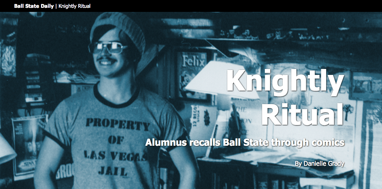
The story is about Jolly Blackburn, a man who creates comics about playing "Dungeons and Dragons" based on his time at Ball State. When I read it, I loved the story, but saw definite need for elements to help break it up.

I emailed Blackburn to ask him if he could illustrate a few scenes from the story. I wanted people to see his work, but I also thought it would be totally meta if he illustrated himself for a Ball State student media story about him creating a comic based on himself and his friends during their time at Ball State.

You follow that? DiCaprio is staring in the movie about it all.

I was able to tweak the template (for lack of a better word) that I had created a while back, so it all went relatively smoothly.

The downside? It exists outside our student media website's CMS. So I had to input all text, photos, etc. manually. Totally inefficient. Definitely motivating me to learn PHP and other server-side languages.


13881861344_4fc5d0f83e.jpg

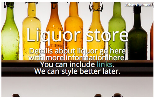
PRETTY PLEASE click the image to see the real ad. This static thing does not do it justice.

This is a fake advertisement I created for article pages on ballstatedaily.com. One of my projects for next year is to help link advertising and editorial a little more effectively.

Thanks Vox Media, for introducing me to this style of ad. (Tangent, I'll be interning there this summer, and I could not be more stoked. I'm positive I'll learn a lot.)


13881481534_92dd1eae9a_o.png

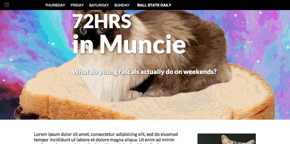
This bit of nonsense is the development of a project in one of my classes. Using an abundance of multimedia, my instructor told my classmates to document student life at Ball State on the weekend.

I get the pleasure of piecing it all together. The content is not yet in, so I am working on creating frameworks that I or my peers can edit with relative ease.

Again, a huge challenge is that I'm not working with a CMS here. I wish I would have had the foresight to learn Tarbell for this.

My life ... would have been so much easier ...

One of the challenges is that I'm working with designers who don't have too much code experience, but who want to help. So I'm creating a bunch of classes (probably more than necessary) so they essentially have a library to work with in helping me construct this.

I hope to publish the finished product by April 21.


In other news, I won first place in the SND Mizzou contest's infographics category for the piece below.

11814614133_fa76e7bd93_o.jpg

Obviously, that's a huge honor, and I'm absolutely thrilled. My staff won several other awards, and my friend, Emily Theis, won third for student designer of the year.

I'm also about a third finished with an online course I'm trying to design to help journalists learn how to scrape data. It's a huge, challenging undertaking. But I'm working with Dr. Adam Kuban and Jennifer Palilonis of Ball State, so I have awesome mentors.

More to come, including a rundown of how Ball State's Unified Media Design Studio functioned this year ... and what the UMDS is.

Read more…

#SNDmakes rethinks articles

We all just want to make the Internet a better place, right?

So that's what a group of coders, designers and thinkers set out to do March 19-22.

At the first #SNDmakes, four teams set out to find solutions to problems users encounter when viewing content with current article forms.

And it. Was. Awesome.

As a student, I was able to sit in a room with a bunch of thoughtful professionals and observe the ways they approach different challenges.

I watched as representatives of traditional newsrooms and newer media brought their ideas to the table, finding answers that could work in either setting. And of course, I was able to bring my own ideas forth, too.

As a group, we asked ourselves, "How might we ... ?" until we had covered a wall with oversized Post Its with possible ideas.

We then selected four questions and split up into four teams to solve them:

My team worked on the last bullet.

With representatives from the San Francisco Chronicle, CNN, NPR, Knight Lab and two student publications, we believed we could all benefit from creating a better video experience.

What we came up with was a format that allows videos to determine their own pace when viewing video. By breaking up an existing video into separate sections and incorporating text, we cut a six-minute video down to an experience of about 45 seconds without eliminating content.

So what did I learn from all this?

• A solution isn't a solution if you can't identify the problem it's attempting to solve. That sounds simple enough, right? But when we were brainstorming about possible projects, several ideas came up that were interesting within themselves, but did not have a purpose except to be cool. In starting with a problem, then developing a solution, we were able to better focus our projects and use our time more efficiently.

• Don't be afraid to kill your darlings. Ask the tough questions along the way. By questioning the process of developing a product continuously, we were able to identify challenges to users and ourselves as we went. But we were also able to fine-tune our mission and create a better end product because of what we asked

• The Internet is totally whack, yo. The folks at #SNDmakes only worked to solve four problems of the many we identified, and so many more problems still exist. But that's awesome. That means smart people have the opportunity to continuously improve upon things and raise standards. And with the promise of new devices entering the market all the time, our job of improving the storytelling experience will never end.

So that's that. Be sure you check out the links above to experience and learn more about each project.

Read more…

I've been published!

On the SND website. I wrote a post about my experience coding my website from scratch.

Here's a bit of it:

Don’t come to me with your questions about coding. I’m not your guy. My knowledge is limited.

But, my limited knowledge is what I hope makes this blog valuable.

Last month, I sat down and began building a website. I had never coded a website before, but in one weekend, I began abandoning the controlled design environments of Wix or SquareSpace and became exposed to the chaos and freedom of coding.

Check out the full post here.

And click here to check out my website.

Expect another update soon.

Read more…

Bullet points.

So again, I've been meaning to write for a while.

Unfortunately, whenever I have the time to do so, I typically fall asleep.

But before I pass out tonight, let me share a few bullet points with you about life at the Ball State Daily News.

• The Daily News ditched its domain name (bsudailynews.com) to be a part of Ball State's College of Communication, Information and Media's new initiative, Unified Media. Unified Media consolidates all student medias, so all staff members work for The Daily (the new entity) while putting out their respective products.

• The website (bsudaily.com) has a lot of kinks to work out. I'm currently assisting in solving those problems. I'm also working as an iDesk editor with several other staffers.

• One of the website's kinks is its inability to support Flash. We're working on getting that resolved. It emphasizes, though, how badly I and my staff need to pick up coding.

• The design editor and I have planned a "The Science of ..." series, explaining how different things affect the human body. The first to run will be "The science of getting drunk." We have a "high" version for 4/20 and caffeine version for midterms. For Valentine's Day, we'll have a "falling in love" one.

• I'm presently working with my editors to devise a social media strategy that we can integrate with The Daily. I'll keep you posted on that.

All this while taking classes.

More later.

Adam

Read more…

Well, I've been meaning to start blogging about my design endeavors for a while. I suppose now – after the thrill, excitement and exhaustion that is election night – is as good a time as any.

Let me first introduce myself! I'm Adam Baumgartner, a student in the journalism-graphics program as Ball State University. I've interned at the Indianapolis Star as a page designer, and I am presently graphics editor for the Ball State Daily News.

It's quite a task.

Though I've taken a multitude of journalism classes, I've only taken one design class to date. Thus, most of my design and visual storytelling experience has come from practice, the patience of peers and self-education. I like to think it's hard work that's paying off.

Last night, hard work definitely seemed to pay off. It was election night. Designers occupied every computer in our section of the newsroom – a occurrence. The design and assistant design editors were both in to oversee the production of the paper. I was managing two staff members – Jennifer Prandato and Michael Boehnlein – in the creation of graphics for the appropriate pages.

Maps of the U.S., Indiana maps, maps of counties, maps of districts. Breakdowns of Indiana's General Assembly and the U.S. Congress. Pie charts, stacked bar charts and bar charts of voter breakdowns. Pie charts of local election statistics.

Together, I, Michael and Jen tore through the data, changing it from numeric values to graphic representations. Counting tiny dots and fact-checking every issue. Live-updating as new information came in.

It was incredible.

Everything that could be done ahead of time, we did. My staffers already had maps of Indiana and the U.S. prepared, so we could mostly fill in the blanks. This made things run much more smoothly.

Still, we had to toe the line between providing the most accurate, up-to-date information and meeting our print deadlines. The problems with print media.

In addition to the print graphics, another designer created an online click-through of how each state's electors voted since 1988.

This evening, I'll likely do the same with all the graphics we published in today's paper. I simply have to update them for the latest results and make them into an interactive.

Of course, I've been looking through the paper and noticing all of the mistakes. Some numbers would have been better represented in different forms. Some maps could have used explainer text.

These are things I'll mention in our next design meeting so we can all improve for next time.

All in all, I'm just humbled to be leading and working with such an incredible, talented and dedicated staff.

That's all for now.

Happy to get the ball rolling on this blogging thing.

Adam

Read more…

Qwikster, Netflix and Branding

Recently mixed into all the brouhaha over the Netflix price increases and eventual separation of DVD- and streaming-based services was the announcement of Qwikster — the awfully named offspring of Netflix.

Now, I can understand the need for price increases. In fact, as a customer, I may even keep both services for a while. But what I can't understand is why Netflix would insist on using such terrible branding for Qwikster.


5520136492?profile=original


I mean, yowza. That's just plain awful. A true typographic travesty. Look, they want to rename the "dinosaur" of the Netflix business model. I get it. But, still, it's been at the center of who they are for more than a decade. Even that awful name would look a little better in the instantly recognizable Netflix typography. It's not just a brand — it's an identity.


5520136662?profile=original


Then again, any other name would likely work.


5520136676?profile=original


The point being, in all their haste to move forward, they're failing to leverage the brand they've already built into something much more powerful. Sure, they'll spin off or terminate DVD rentals some day. But today is not that day. Netflix really had an opportunity here to distinctly brand their two halves while creating a coherent, powerful central identity. Perhaps their goal is to unload Qwikster almost immediately. Perhaps I will soon be subscribing to Qwikster, a Blockbuster company. Or perhaps, in this market, Netflix will be stuck with this division for at least the near future.

I wish the Netflix leadership had seen this as an opportunity for graceful divestment of a popular, long-standing product. I wish this had been seen as an opportunity to revamp the company's streaming identity to better take advantage of the medium (or at least not blind me every time I see that blaring red screen on my TV). I suppose, the mildly sentimental fool I am, that the DVD service deserves more than a slapdash logo and a boot out the door. Or at least a chance to see those bold letterforms gracing my mailbox for a few more years.

Read more…