tips (9)

So November marks my sixth month at Vox Media.

That's pretty cool.

I'm beyond fortunate that they hired me on to work part time from beautiful Muncie, Ind. while I finish up my degree.

But working remotely has definitely come with its own set of challenges. I realized recently that none of the time I spent in various workplaces prepared me to produce from home.

Here's a bit of what I'm talking about, and a few tips for if you ever work remotely ...

1) Step into my office

5520193062?profile=original

My first few weeks in Muncie, I spent a lot of time horizontal. I did everything from my bed. And it seemed awesome.

That is, until I started getting back pains and was restless when trying to sleep.

I don't think I need to cite any science journals for you to believe me when I say working from bed — though cool to a 22-year-old — is a bad idea.

To compensate for my more-sedentary-than-normal life change, I began doing yoga, and that helped immensely. I also started taking breaks throughout the day to do pushups or sit ups.

Oh, and I started working at my desk.

The desk thing mostly took care of my restlessness. I realized my bed was no longer a place to relax and that the stress from my day was carrying over into my nights. Moving that tension from my bed to another location pretty much did the trick.

So don't be me. Live a vertical life.

2) We are humans, not robots

OK, except for the actual robots.

5520193457?profile=original

It can be hard to grab people's attention, whether on a chat client or via email or whatever else. If you are not a physical, in-your-face entity, it can be a real challenge to get people to answer you.

I can't blame them. I don't always pay attention to the many little red dots notifying me of messages, either.

My buddy, Warren Schultheis, gave me a tip for this one: video chat. When possible, reach out to people with Google Hangouts or Skype so you and the person you're communicating with can hear voices and see faces and remember you're both humans.

If people can't commit to spontaneous video chats, setting up a regular meeting time is just as effective, I think. It still reminds people you're more than a red dot and a *ping.*

3) You are not alone ... you just feel alone5520193672?profile=original

Piggybacking off my last point, I have to say, REMEMBER TO COLLABORATE. It can be really easy to work in a vacuum when remote. But doing so will just postpone confrontation of imminent problems and lead to frustration all the way around. Expecting yourself to collaborate throughout the process is absolutely crucial. Even if it means harassing people.

This is especially true if you're green and have a stupid amount of stuff to learn, as I do.

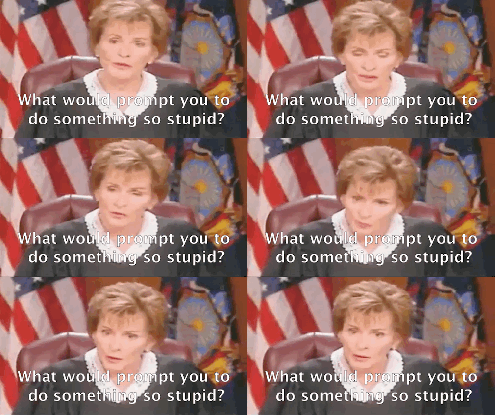
4) Judge Judy is not your co-worker

If you're like me, you appreciate having some background noise as you create.

When I started working from home, I used the TV as that background noise. That was fine, until I realized I was getting hooked on court TV shows and daytime dramas.

Do yourself a favor and stick to music or podcasts. According to science, music can actually help your productivity, anyway.

Don't let Judge Judy's burning glare distract you from your projects.
tumblr_mm8axc0HUn1rflkf7o3_500.gif

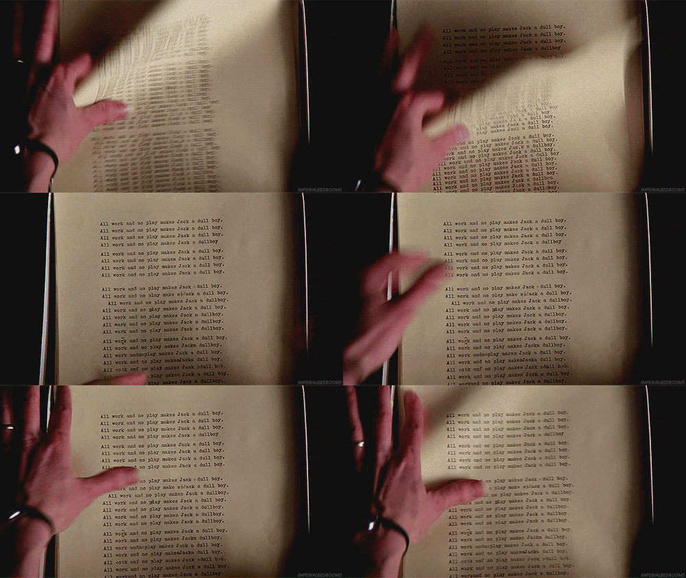
5) All work and no play makes Adam a dull boy

Schedule your work hours and stick to them. If you don't have a meeting until 3 p.m., it can be tempting to sleep in an extra half hour. Don't do it.

When working in an office, your arrival and departure from work serve as very blatant cues as to when you need to start and stop producing. You don't have those cues if you're working from the same place you live.

So create those cues. Keeping yourself on a schedule helps you stay balanced and keeps you accountable.

I've been struggling to keep myself out of a perpetual state of "just let me tweak one more thing." I've also had to remind myself that 10 p.m. on a Friday is a perfectly acceptable time to stop working and start hanging out with friends.

Beyond cultivating an internal clock, keeping a strict work schedule helps me work, play, and take care of myself.

Otherwise, I wouldn't eat. And all work and no food makes Adam a cranky boy.
tumblr_m11wxp5k5F1qgcra2o1_500.gif

6) Get out of your damn house

I realized when I started having conversations with my pet fish that I needed to get out. So I started working at my favorite coffee shop or relocating to Ball State's library when I started to go stir crazy.

Switching up camp grounds helps me fend off depression from a lack of socialization, boosts my productivity, and exposes me to better coffee than the crap I have at home.

All in all, a good thing.

So that's the gist of it.

After three months of working from home, I've pretty well adjusted to the challenges and have honestly become a better adjusted person than ever before.

Plus, the communication skills I've gained from these relatively weird technological constraints are totally going to help me in the long run.

The world is becoming smaller and offices more spread out as people phone into meetings from all over the world. Don't be caught off guard when you're expected to telecommute at some point in your life.

If you work from home or work with many remote employees, please feel free to post tips in the comments or tweet them at me.

I can make a list of quick advice to share with the world.

Read more…

5520146696?profile=original

Seth Godin says we don’t buy things because we need them, we buy them because we want them.

Newspapers don’t just sell information; they sell an experience. Along with photographers, illustrators and of course, some writers, designers help make that oh-so-important emotional connection with readers.

Good presentation tells the story. Great presentation brings the reader into the story like the soundtrack of a movie.

Satisfaction is important, but desire? Turn it up to 11.

Read more…

A visual journalist's survival guide: Type as art

This page by Kristin Lenz treats type as art in the most literal sense, with the letter forms functioning much like an abstract painting.


"We got more space than we expected, so can you make us a cover for the calendar spread this afternoon? I'm sure you'll think of something." Using the sya-what-it-is strategy, Chris Mihal added various fake perspectives to the letters for complexity.


The above page by Puls Biznesu uses a type grid that counts down from 100 as a background.


Brandon Ferrill's Medicare cover also uses type as a background, while adding an iconic stock art element to help sell the content.


Here Christian Font uses an extended quote as the background headline and billboard-style refer to the story.


The page on the left introduces a fingerprint as a graphic element, where the page on the right, by Severiano Galván, uses information to draw the fingerprint.


Negative space within the story creates Oscar art for Flavio Forner's page.


The page by the Plain Dealer has prices falling from the headline. In an interesting twist, Ellis Latham-Brown's page from the Indiana Daily student has the story copy falling into a pile.


Letters are nibbled off in crumble at the bottom of Jussi Tuulensuu's page.


Pete Gorski's page uses the headline to help illustrate a pro/con story on Roe vs. Wade. Sometimes small papers can be more willing to take risks.


And finally, Paul Wallen's page illustrating the big eastern US blackout uses plenty of "black space" to make its point.


As I was working on this, Denis Reagan posted pictures of type driven pages from SND's judging in Syracuse. Here's the link.


Read more…
So you have an important story with no art and no illustration budget. Here are a few ideas that could help you out.

Type as illustration:
Using type as your art can be as straight forward as turning up your storytelling really loud. Here's an example by Margit Toovere.


Here are a couple other examples where the story shape becomes the art. On the left, a page by Politiken. On the right, a page I did long ago at the Sun Journal. We took a lot of care to keep the story legible and there were no complaints from readers. It was interesting to watch people holding their paper at a 45-degree angle to read the story.


Stock images and file images:
This centerpiece by Nuri Ducassi still uses type as the dominant art, but adds small iconic images to punctuate and help the content be more accessible.


It's pretty easy to find stock images to illustrate your story at one of the many stock photo websites out there. My staff uses bigstockphoto.com quite a bit. Here are a couple examples that looked for images that express a simple visual metaphor that, combined with the right display type, helps to sell the story. The page on the left is by Brandon Ferrill and on the right, by Suzy Palma.


Admittedly, our editor was squeamish about a big picture of pavement on the front page. I suppose we could have assigned a photo of someone getting a ticket, but sometimes being literal is not so engaging.

Mug shots as dominant art:
When Julie Elman was at the Virginian Pilot, she was a master at this. Here's an example. What makes it work is that she used the colored text blocks to tie it together into a single dominant piece.


Take the picture yourself:
I'm not suggesting that everyone is suddenly a photographer. In fact, try to use your limitations as an advantage. How about a deliberately low-tech approach like using a plastic Holga camera or even your cell phone? The centerpiece image of the office building on this page was taken and manipulated by Taimy Alvarez on her iPhone.


The flat-bed photo studio:
You may be surprised how well a flat-bed scanner will scan objects. Some of the things I have scanned so far are a business editor's face, crumpled documents, TV cable, barbed wire and mud. Here are a couple examples.


Mediocre handout art:
I always try to respect the work of photographers, but entertainment handout images are fair game for manipulation. Just be cautious with Photoshop filters. Poor use of Photoshop is the biggest cliché of bad illustration. Here are a couple examples that use extreme crops to make the images more abstract and more engaging.


Anyone else have any examples to share?

Next up: More examples of type as art.
Read more…

If your story is about something tangible and specific, shoot it. If the story is about concept or abstract idea, illustrate it. How many of your publications would illustrate a story on rising airfare by sending a photographer to the airport? My paper had a strong tradition of documentary photography, so in the past, we would have done that as well. Here's an example:

The art here says that someone is going on a trip. Verrrrry exciting. It's not the photographer's fault. This was a lame assignment. While we should relate to the tragedy that this family is paying higher airfares, the page should really be telling us that WE will be paying higher airfares. We've turned up the volume in general, but this recent page, illustrated by Chris Mihal, tries to get the point across more visually.

It's just about picking the best approach to get people to read the story and to immediately know what the story is about. We find we use illustrations a lot in Business because there are a lot of stories that are more abstract in nature. And we run a lot more useful, consumer oriented stories on the front page, so we run a lot more illustrations there as well. My apologies if this is overly obvious, but a lot of papers still have misguided preconceptions, especially where non-visual managers are calling the shots. I once heard from a former editor, "We are a serious newspaper. That doesn't belong on the front page." When illustrations are the best choice, it's up to us to respectfully suggest otherwise. Up next: No art? No problem.
Read more…
This page, brilliantly illustrated by Andrea Levy of the Plain Dealer, is a great example of the value of being able to sell your ideas. How many of your papers would run a page like this?

The best argument to do so is that having fun with your work is one of the best ways to engage readers. And to use a little pseudo-science, dopamine caused by any "wow" you can generate will better imprint the experience on your readers' minds. Of course, we need to have the appropriate tone for serious stories, but when there are opportunities, why play it safe? Here's another example, this one by Tiffany Pease, when she was at the Charlotte Observer, that is a little less outrageous, but certainly memorable. It's also a great example of design collaborating with photography.

Here's an example by Randy Palmer at the Dayton Daily News. I love the simplicity.

The mustard squirt is something we've all seen, but how many of us would think to use it to illustrated a festivals cover? Really smart putting the branding for the section on the mustard packet. And here's one more example, this one by the Sun Sentinel's Chris Mihal. This is the cover of the yearly Florida Travel section. The illustration is big but the type is tiny. (Click the thumbnail for a closer look.)

To me, this was like one of those word puzzles, where you find and circle the words in a sea of letters. Maybe everyone won't like this, but it makes the page more interactive. Ok, here is one of my own examples, just to show that I practice what I preach. This is an "antique" from the Sun Journal back in 2001.

Using chains to illustrate a story about security jobs might be a stretch, but I thought if we did, we may as well lock up the whole page. These are just a few from my collection. If you have any favorite examples, you can post them right in the comments.
Read more…
Sometimes, truly innovative creative work really can scare the hell out of editors. Maybe I exaggerate, but it does require some courage to take risks – to do anything non-standard. I've been lucky to work with some editors who have had have the courage and the trust to allow us to take a chance on some new ideas. It doesn't happen overnight, though. It comes from building trust with your editors and especially from expanding the comfort bubble. How many of you have done work that was killed by one editor or another? It's easy to get discouraged and think of that as wasted effort. The reality is that every time you expose the newsroom to an idea that seems a little too far, you are desensitizing them to that kind of work, expanding the comfort bubble. And over the long run, attitudes will change. Most of us know the strategy of showing several choices, one of which is a little extreme, to make the one you can live with seem more acceptable. Here's an example.

During our last redesign, Tribune's innovation officer suggested an all-map front page, something to make us stand out from the competition. That concept was radical enough that it helped us push the redesign much further. Our goal wasn't just to be unconventional. but to reach a specific demographic in the South Florida market. This was for a big project, but the same techniques work on a day-to-day, long-haul basis as well. If you are patient and politely persistent, you will move the needle over the long haul. No one will say that visuals need to be more important unless you start the conversation.
Read more…

In this business it's not always about how good you are but how good you are at selling your ideas. It doesn't do much good to do amazing work if you can't get it published. It's really about the language we use when selling our ideas. If we want to be credible leaders in the newsroom, we need to talk about the work in terms of readership. Creative intelligent work needs to be a bottom-line issue. Forgive me if this sounds simplistic, but I have seen too many newsrooms where the visual departments are far from equal partners in the storytelling process. You want a seat at the table. We all want to do good work. And if your arguments for your work are about making your pages more compelling to readers and making your content more accessible, you'll find it much easier to sell your ideas. Doing your homework will also make your arguments more bulletproof. Poynter's eye tracking studies offer some good nuggets. This one offers some scientific support for short-form storytelling. And I have to admit to quoting Mario Garcia in the past because he's a visual expert known to most editors. Changing the culture of newsrooms doesn't happen overnight, but now's a good time to decide to be taken seriously. How's the culture in your newsroom?
Read more…
Yes, if you're not scaring your boss, you're probably not trying hard enough. My staff has probably heard me use that expression too many times. It's really just about doing innovative work, but even more so about getting us out of our comfort zone. Let's face it. We can't afford to be comfortable right now. Newspapers are under a state of siege and visual journalists are all too often the victims. Who wants to be a victim when there's still a chance to play offense? When newspapers are forced to cut staff, visual journalists are often perceived to be all too expendable. The most extreme examples have actually resulted in the elimination of entire departments, blogged by Charles Apple here and here. Pretty scary. But really, newspapers need creative professionals more than ever. Who else is going to bring the innovation that newspapers desperately need in order to survive the new media landscape? Papers like Puls Biznesu in Poland have shown that it can work. Of course, it's all pointless you have brilliant ideas to which no one will listen. Often the most successful creative professionals are at least as good at selling their ideas as they are at their work. We'll talk more about that in coming days. At this point, we have nothing to lose. We can keep our heads down, stay off the radar and take our chances. Or, we can be the ones who are trying to shake things up and move the ball forward. So what do you say? Let's go out and scare our bosses, just a little. Up next: Good work vs. readership
Read more…