newspaper (3)

Valuable Resources for Newspaper Designers

I just wanted to write a quick post on some design resources I have found to be invaluable as a newspaper designer. This blog post is from my website, newspaperdesigners.com. Here is a list and breakdown of the resources I currently use:

1. Adobe Creative Cloud Subscription

This is a must have for every serious newspaper designer. With a yearly subscription you'll get access to all the Adobe products - specifically Adobe InDesign, Photoshop, and Illustrator. These 3 killer apps are what I use primarily and often only for making newspaper templates. Get your subscription here.

lobby-bg-bf2016-loggedout-1400x860.jpg?format=1000w

The Creative Cloud logo

2. Typekit and Skyfonts Subscription

Don't break your bank account by buying individual fonts! Sign up for a Typekit and Skyfonts subscription. I believe Typekit comes with Adobe Creative Cloud so you won't have to "sign up" per se, just having a subscription to Creative Cloud will do. These two font retailers look after all my font needs for designing newspaper templates. Subscribe to Skyfonts here.

?format=1000w

An animation showing different fonts

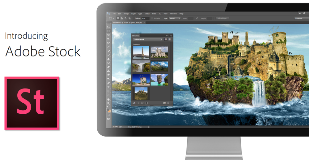
3. Subscribe to Adobe Stock

Adobe Stock has a great selection to high quality images, for a relatively good monthly price. Subscribe to Adobe Stock here.

?format=1000w

Adobe Stock images can be searched from within Photoshop

4. Use Pixabay

I've had some good success in finding images on Pixabay. The images and the photos are high resolution. Best of all, they cost nothing! Visit their website here.

?format=750w

Free, high resolution images from Pixabay

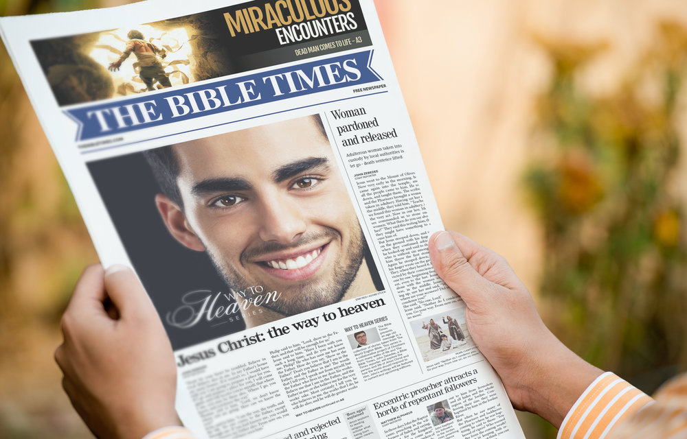
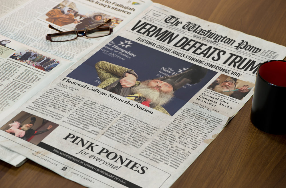
5. Download and try some newspaper templates

Need I say more? It will save you time in producing a newspaper. Newspaper templates are super easy to customize and include all the fonts and images. Get newspaper templates here.

?format=1000w

Newspaper template from newspaperdesigners.com

6. Try a customization service

To further ease the pain of creating a template from scratch, get the first page of your newspaper template developed here, with the template thrown in for free!

?format=1000w
Read more…

The end of the first semester

It has been a long, grueling, unforgiving semester filled with disappointing, dream crushing, heart smashing, and most importantly, a very passionate staff that I'm extremely grateful for. 

I started out this semester as a designer-turned-editor thinking this was going to be a piece of cake. To some extent this was true, but most of that notion was immediately proven wrong. Managing a staff of 10 with 40-50 writers is very hard.

But it wasn't just the staff and new management challenges which arose, it was the burden having to baby a new redesign to a publication that hasn't had a refresher in nearly eight years. Wait, yes, exactly eight years. I think we did okay, though. Those long days in the summer, pent up in front of a computer monitor with a bag of cheetos, were worth it. I had my adviser and managing editor to assist briefly at times, which took some of the burden off.

One thing that I didn't expect was having the hard-working and passionate staff that came to be. I've been with The Clarion since I started at Madison College, and I've only ever seen one or two staff who are passionate at a time. The whole lot of us invested a lot, though, and I hope it continues into next semester.

Some things I know I will be better at next semester:

- Designing efficiently: towards the last three-or-so issues, I could design nearly the entire publication alone. One of our designers left, so I had to pick up the slack. About 4 pages of slack, to be exact.

- Managing story and budget meetings

- Knowing when to use food as a bribery: almost never used it this semester, except at the end when I knew people would fall off the face of the planet.

- Knowing when to put a foot down and say no

- Planning for illustrations and graphics

- Knowing what stories to look for and who to give them to

- Reacting to staff drama: all of it focused on one staff member, who ended up having to leave us.

My graphic design classes could never teach me these things, and I'm glad I can utilize these skills now while still being able to design and have fun on a visual level.

All that's left this semester is to apply for the SND annual contest and hope for the best.

Cheers,

George

Read more…