All Posts (536)

Sort by

5520165457?profile=original

John Niedermeyer

At SND 2014 in Frankfurt, Germany, I had the opportunity to sit down with John Niedermeyer of The New York Times. Niedermeyer is deputy director of digital news design and works on pieces like the Invisible Child series.

Here are a few of my favorite moments from the interview. To read the whole Q&A, visit SND's website.

---

AB: You’ve spoken a lot about bringing a digital mindset to the workplace. That’s a struggle at a lot of journalism schools, too. I know the Times partnered with Indiana University to create an iteration of NYT Now. That said, what do you think journalism schools should be doing to prepare designers, reporters, or even developers for the modern and changing newsroom environment.

JN: I know there’s this idea that, “Oh, you’ve got to learn HTML and you’ve got to work Photoshop and do it all,” if you want to be an online editor or producer, if you want to start your career that way.

"I think those skills are important, but they might be overvalued."

I think those things help, especially if you’re working at a smaller place where you have an opportunity to wear many hats like that if you can cobble something together and get it up on the site.

I think those skills are important, but they might be overvalued. I think the things you learn in journalism school around judgment, basic writing skills are very useful.

---

AB: How reusable are the projects that you build? A huge thing that people are concerned about is scaleability. … Has any of this been templated, or has any of this influenced tools in other parts of the newsroom?

JN: Yeah, I mean, the graphics group, the design group and the interactive news technology group, those are the three big groups of developers and designers in the newsroom. We’re all in GitHub. We have a private Git repository. So a lot of times, a project will come up fast on deadline, and we’ll know, “Oh, this could take the form of this other thing so-and-so did two weeks ago.”

I wish we got better about documenting those things or collecting them in a way that someone who hasn’t worked there for seven years would know how to find them, and so they know that they could just clone that project. That would get them a start or 70 percent the way there. …

We make use of tools like Google Spreadsheets to be able to give someone who isn’t a technical person an editing process so they can hit publish, spit out a JSON file that we can consume and use for a presentation.

A couple of folks in my team and in graphics came up with what we’re calling a photo essay template, which, with the support of a spreadsheet, allows us to spin up a very quick and dirty photo essay with text and large photos. It’s outside of the article template at the moment, but it’s a tool that helps with those pieces that will hopefully someday be available inside of the CMS.

---

AB: This one is maybe a little more delicate. What are your thoughts on the Times’ innovation report, especially given your work in the digital realm.

JN: A lot of us in the digital world, I think, were nodding along as we read this thing.

There also were things written into it that were rhetorical devices. The document was intended to jar us out of our complacency, and say, “No, look, this is happening. You can’t just say you’re the New York Times and everything will take care of itself.”

So, the thing I’m really excited to have come out of it is, we have an audience development person, Alex MacCallum, who has been placed in the masthead and who has been placed in charge of getting to know our readers better and is helping us figure out how to give them what they went and what they need and how best to do that.

I like that.

I think we’ve made progress on the sort of ushering everything to the print Sunday schedule. I think we’ve made progress getting stuff up earlier in the week when I think people are at their desks and maybe looking for something to read.

"That takes a massive sort of technology investment that is also happening right now."

I think we’re doing a lot on the technology side of stuff that isn’t readily available to readers right now, but it’s stuff that is connecting threads behind the scenes that is related content.

It’s hard for us to get readers more coverage. If they’re interested in a story about Syria or Iraq, how do I tease out the right things from the archive that would help illuminate that for the reader?

That takes a massive sort of technology investment that is also happening right now.

Eventually, once this is complete, we’ll be better able to suggest those sort of things to readers, either because they’re related to what they’re reading, or because there’s a personalization angle.

If you like opinion, maybe there’s a way we can put more of that in front of you without losing the editorial judgment that something like our homepage or A1 brings.

We never want to lose that, but there has to be more for our readers. They’re coming from so many different countries, different cities, they’re wanting different things. We have such a breadth of coverage that we just need to figure out technologically how to help them get there.

Read the whole Q&A here.

Read more…

A refreshed portfolio

About a year ago, I created this portfolio site for myself.

It was kind of a BFD to me, because it was the first time I coded anything, and retrospectively, it was the first time outside of Myspace that I really contemplated web design.

But it was awful. It was just a rough, scratch-pad type website that I let live for too long.

A few weeks ago, I completely redid my website using everything I learned at Vox Media, the company I currently work part time for.

Here's a look at what I did and why.

1) Nix the branding

The massive, circular head drowning in a sea of yellow had to go.

When I designed my "logo" a year ago, I wanted to create something visual instead of relying on my initials to get my identity across. What did I want my logo to accomplish back then?

5520158680?profile=original

• I wanted it to say I'm playful.

• I wanted people to see it and instinctively think "Adam."

• I wanted it to be different from what I saw my peers doing ... though shortly after I created it, it seems a lot of people had been going through a similar thought process.

• I was stuck on this slogan, "Consider me well-rounded." So a visual pun seemed necessary ...

I think the design accomplished those things. But it was very juvenile. And I think I outgrew it.

So, I redesigned. Now, it's raining glasses.

5520159258?profile=original

What did I want this visual identity to accomplish?


 • I wanted to convey thoughtfulness, and I believe glasses carry studious connotations with them.

• I wanted something that sets a tone instead of acting as a lead image. On the Twitter app, for instance, the frosted glass look of the hero obscures the glasses so only the colors – and hopefully the mood – remain. 

• I wanted my new design to connect somehow to my old, so it could be a sort of evolution. Though loose, I think the glasses accomplish this by referencing the glasses on my featureless Kirby face.

• Connect across platforms. Because this is a pattern, it is something I can easily replicate across platforms. I use it as the hero on my website, the cover on my Twitter and even the back of my business card. The tone and message of my website are carried throughout my branding.

2) Focus on the experience

One of the critiques one of my bosses gave me at Vox is that I need to focus on user experience consistently throughout the design process. What happens on hover? How does it happen? Will users want to click or interact with a piece of content in another way? What are the design cues saying ... or what aren't they saying?

So. I tried to conquer that.

• First of all, I try to make the site engaging from the get go, using JS to change the hero's greeting based on the time of day.5520158889?profile=original

• Small cues help users understand what's happening. For instance, the menu changes states based on where a user is on the page. Subtle, done often, but an improvement from my last site.

5520162665?profile=original

When hovering over my portfolio tiles, my glasses appear. This connects to my branding, but also says, "Hey, there is more to see if you click." Get it? ;)

5520162873?profile=original

• One critique I got often was that I had no descriptions giving context to my work. So, I added modals that help keep the home page clean, but allow me to dive into my content more than before. This also allows me to explain multi-piece projects more clearly.

5520162896?profile=original

• There's a surprise hiding on my site ... (Hint: Do the Konami Code.)

5520163491?profile=original

3) Clean the code

OK, so it's actually still pretty sloppy. But before, coding was to me more a game of guess and check. Now, the code is much more navigable, making better use of classes, IDs, children and otherwise. I made better use of GitHub, too, and embraced JS and JQuery with more open arms.

Check me out on GitHub.

4) Consider different devices and screen sizes from the start

This goal allowed me to nix the Pinterest-esque tiles of my old site and pursue something a bit cleaner but allowing me to crop my images and decrease their sizes.

The images on the main screen are all relatively small, so they won't eat data. The images in the modals are much larger, but only load when the modals are called. At least ... that's what I imagined would happen. i think my code for lazy loading is broken, so I'll dive into that soon. (Open to hints.)

My old site was like "LOL TABLETS" but this one accommodates those corresponding screen sizes much more nicely.

Before:

5520163858?profile=original

After:

5520163658?profile=original

Anyway, thats the website rundown. See the "finished" thing here.

A few quick notes:

• I'm in Frankfurt for SND. Check out the photos and tweets of my misadventures.

• Interning for Vox Media this summer was great, so I'm stoked that I still part time for them from Indiana. Right now, I'm working with a few others on the Racked redesign. So much to blog about, I don't know where to start.

• I am looking for jobs starting in May ... so ... hire me?

Gute Nacht.

Read more…

September 4, 2014

5520179673?profile=original

Illustration by Peter Strain. Art direction & design by Dan Worthington.

Looking for a better way to post the page of the day, so that the previous versions are archived. Suggestions welcome.

Read more…

Muntazir Yaseen

  • Cover model should look straight into the camera. Eye contact is important.
  • When designing a cover you can play around, you can exaggerate, but you should remain within your concept and style and you should know what to exaggerate.
  • Each cover needs one headline that will pop out. In size, in color, in attitude.
  • The cover page should have a focus point. It can be a model in the image it can be a headline or a number, but something has to draw the eye.
  • Divide your cover in three sections. Big one with main cover line, smaller one with few cover lines and the smallest one with few more cover lines.
  • If you plan to use orange color for the cover lines print them with additional spot color. Orange never looks good if printed in traditional CMYK process. It will look brownish.
  • Green is the least used color on cover pages and red is the most used one. Whichever you use, make sure you have a contrast between colors.
  • Main color has to be different than the one in the previous issue. Buyers may mistakenly replace the new issue with the old one and not buy it.
  • They say black covers do not sell. They are wrong.
  • For smaller cover lines, preferably go with black text or white if the background is dark. For bigger ones use colors.
  • Masthead’s position is not a sacred one. If you think you can achieve something, for example boost sales with a cover line above the masthead than go for it. Move the masthead little bit below and add some cover line above it even if you have never done it. This can be great if your magazine is tucked away on the shelves. This extra space can be useful.
  • In USA magazines are racked in waterfall presentation so the top third of the magazine is the most visible part and there you will see the biggest cover lines. In Europe it is the different story. Over here magazines are stacked so that the left third of the magazine is the most visible one. This is why there are so many magazines in Europe with masthead in top left position.
  • Photography looks better and sells more than illustrations on the cover page.
  • It does not matter if you shoot the cover model in your studio or if you buy stock photo of a model background has to be in solid color. Any patterns or mixing colors in the background will make your life hell when designing a cover page.
Read more…

Vaya coincidencia!

5520171093?profile=original

Mis amigos me dijeron, "que onda se las vendiste o que?!", "Que como es posible y que poca!..."

Yo no me di cuenta; ellos tan solo me alertaron de que había esta infografía circulando con la misma disposición de elementos tanto que les ha parecido un 'fusil' descarado.


Bueno estas cosas pasan; -fue lo que les dije- son esas terribles coincidencias, accidentes azarosos que surgen simultaneamente por ahi. Nadie podría ser responsable ante algo asi.

Por una parte, me siento alagado; no sabia que mi trabajo fuera tan importante como para ser un referente de esas magnitudes; digamos que de alguna manera el ser  "imitado" es algo adulador y ligeramente incómodo pero no pasa nada. Todos estamos conectados y asi son los accidentes.

Pero por otro lado reflexiono sobre la pobreza editorial de algunos medios mexicanos supuestamente expertos en la materia.

Fue el 12 de enero de 2014 que el gráfico titulado "A Ball Story" salió publicado en el diario Gulf News en Dubai, EAU. Entonces a 150 días del mundial.


EL Heraldo publicó su grafico el dia 22 de abril de 2014. Al menos fueron más honestos al no firmarla. Lo que alcanzo a ver es solo el crédito redacción deportes.


Récord omitió la fecha por obvias razones, asi Jesús R. Sánchez y Luis Zubieta pueden presumir ampliamente que ellos la hicieron antes, me imagino que por eso fue.


El gráfico  "A Ball Story" fue vendido como servicio de agencia por Gulf News a la revista FOCUS MAGAZINE de Polonia por la cantidad de $250 dls y ha de estar también circulando por ahi pero en polaco.


"Les hubiera salido más barato si nos lo compraban y luego nada más lo traducían" Me dijo otro amigo de Gulf News.

Quizás pero hay quienes prefieren soluciones más baratas.


Enhorabuena! y muchas gracias.


Atte: José Luis Barros Chaparro


Read more…

Like Alice in Wonderland

So I've been coding my buns off lately.

I feel like I'm lost in coding Wonderland. I haven't encountered the Mad Hatter yet. Just CMS-es that eat CSS.

I'm definitely still not a code expert.

But in the last 24 hours, I've published this piece, created new ad spots for my student paper's website and worked on this ongoing project.

Just a quick breakdown of these tasks ...

13879703734_612015a74a_o.png

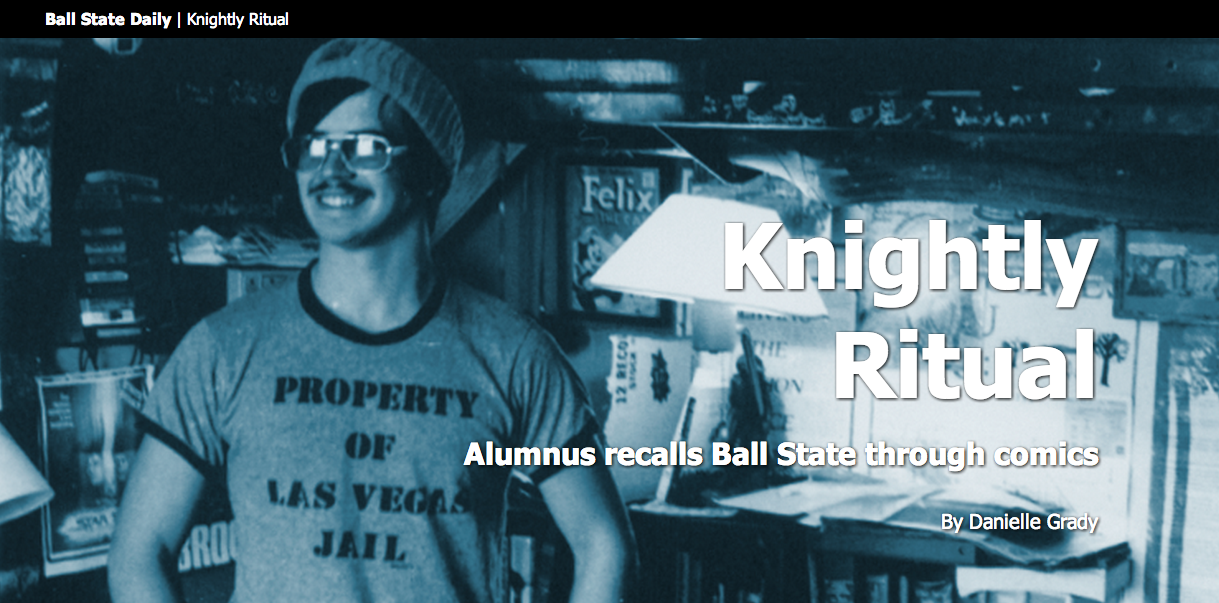
The story is about Jolly Blackburn, a man who creates comics about playing "Dungeons and Dragons" based on his time at Ball State. When I read it, I loved the story, but saw definite need for elements to help break it up.

I emailed Blackburn to ask him if he could illustrate a few scenes from the story. I wanted people to see his work, but I also thought it would be totally meta if he illustrated himself for a Ball State student media story about him creating a comic based on himself and his friends during their time at Ball State.

You follow that? DiCaprio is staring in the movie about it all.

I was able to tweak the template (for lack of a better word) that I had created a while back, so it all went relatively smoothly.

The downside? It exists outside our student media website's CMS. So I had to input all text, photos, etc. manually. Totally inefficient. Definitely motivating me to learn PHP and other server-side languages.


13881861344_4fc5d0f83e.jpg

PRETTY PLEASE click the image to see the real ad. This static thing does not do it justice.

This is a fake advertisement I created for article pages on ballstatedaily.com. One of my projects for next year is to help link advertising and editorial a little more effectively.

Thanks Vox Media, for introducing me to this style of ad. (Tangent, I'll be interning there this summer, and I could not be more stoked. I'm positive I'll learn a lot.)


13881481534_92dd1eae9a_o.png

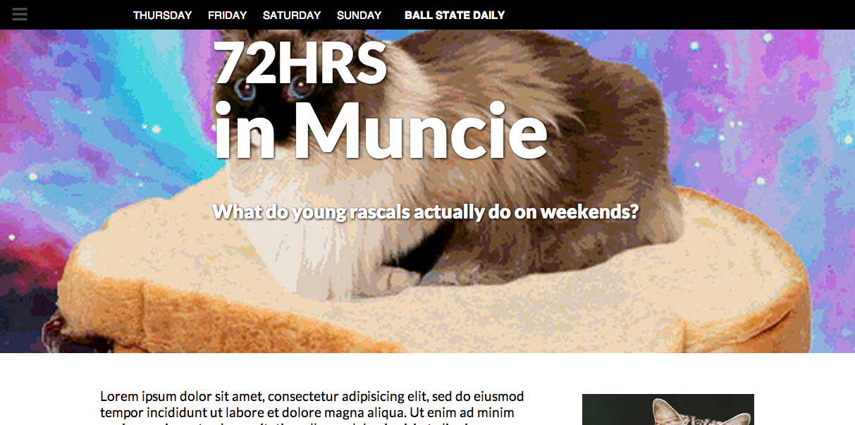
This bit of nonsense is the development of a project in one of my classes. Using an abundance of multimedia, my instructor told my classmates to document student life at Ball State on the weekend.

I get the pleasure of piecing it all together. The content is not yet in, so I am working on creating frameworks that I or my peers can edit with relative ease.

Again, a huge challenge is that I'm not working with a CMS here. I wish I would have had the foresight to learn Tarbell for this.

My life ... would have been so much easier ...

One of the challenges is that I'm working with designers who don't have too much code experience, but who want to help. So I'm creating a bunch of classes (probably more than necessary) so they essentially have a library to work with in helping me construct this.

I hope to publish the finished product by April 21.


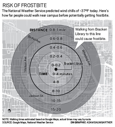
In other news, I won first place in the SND Mizzou contest's infographics category for the piece below.

11814614133_fa76e7bd93_o.jpg

Obviously, that's a huge honor, and I'm absolutely thrilled. My staff won several other awards, and my friend, Emily Theis, won third for student designer of the year.

I'm also about a third finished with an online course I'm trying to design to help journalists learn how to scrape data. It's a huge, challenging undertaking. But I'm working with Dr. Adam Kuban and Jennifer Palilonis of Ball State, so I have awesome mentors.

More to come, including a rundown of how Ball State's Unified Media Design Studio functioned this year ... and what the UMDS is.

Read more…

#SNDmakes rethinks articles

We all just want to make the Internet a better place, right?

So that's what a group of coders, designers and thinkers set out to do March 19-22.

At the first #SNDmakes, four teams set out to find solutions to problems users encounter when viewing content with current article forms.

And it. Was. Awesome.

As a student, I was able to sit in a room with a bunch of thoughtful professionals and observe the ways they approach different challenges.

I watched as representatives of traditional newsrooms and newer media brought their ideas to the table, finding answers that could work in either setting. And of course, I was able to bring my own ideas forth, too.

As a group, we asked ourselves, "How might we ... ?" until we had covered a wall with oversized Post Its with possible ideas.

We then selected four questions and split up into four teams to solve them:

My team worked on the last bullet.

With representatives from the San Francisco Chronicle, CNN, NPR, Knight Lab and two student publications, we believed we could all benefit from creating a better video experience.

What we came up with was a format that allows videos to determine their own pace when viewing video. By breaking up an existing video into separate sections and incorporating text, we cut a six-minute video down to an experience of about 45 seconds without eliminating content.

So what did I learn from all this?

• A solution isn't a solution if you can't identify the problem it's attempting to solve. That sounds simple enough, right? But when we were brainstorming about possible projects, several ideas came up that were interesting within themselves, but did not have a purpose except to be cool. In starting with a problem, then developing a solution, we were able to better focus our projects and use our time more efficiently.

• Don't be afraid to kill your darlings. Ask the tough questions along the way. By questioning the process of developing a product continuously, we were able to identify challenges to users and ourselves as we went. But we were also able to fine-tune our mission and create a better end product because of what we asked

• The Internet is totally whack, yo. The folks at #SNDmakes only worked to solve four problems of the many we identified, and so many more problems still exist. But that's awesome. That means smart people have the opportunity to continuously improve upon things and raise standards. And with the promise of new devices entering the market all the time, our job of improving the storytelling experience will never end.

So that's that. Be sure you check out the links above to experience and learn more about each project.

Read more…

5520166899?profile=original


La copa mundial de carreras de caballos tuvo lugar en Dubai el pasado 29 de marzo. Por tal motivo me resultó interesante proponer un tema sobre ese mundo y lo que hay detrás de los jugosos premios. Siempre hablar de dinero en cualquiera de sus ámbitos será un gancho para atraer lectores; eso lo aprendí de Roger Toll en una de las sesiones de un taller de Edición que impartió a principios de siglo en las entrañas de Grupo Editorial Expansión. Historias de dinero y exponirndo sus números son algo verdaderamente atractivo. En este caso no fue la excepción, mostrar como se reparte un premio de 10 millones de dólares y las personas involucradas en ello puede ser algo que despierte morbo o simple curiosidad.

La infografía fue publicada en el diario Gulf News y se conto con el valioso apoyo del editor Leslie Wilson, su aportación fue crucial a la hora de cotejar y confirmar los datos a través de sus fuentes.

Read more…

BSU at the Games

It's been a crazy two weeks.

I've been participating in a class at Ball State called "BSU at the Games." In it, more than 40 students act as a media group creating content for the Olympics.

Most participants went to Sochi, but seven of us voyaged to the land that I love, Chicago, to make graphics for the Tribune.

ON A SMALL SCALE

We are primarily visual journalism students, though some of us are in advertising.

It's been one heck of an experience.

Though I am returning to the Tribune, this is several students' first time in a newsroom environment.

And it has gone ... smoothly. To date, we have had 17 pieces published, including two full page graphics. (See one here.) We have at least four more we are working on.

Students are learning the true meaning of the word "deadline," as well as how to produce high-quality graphics with a lot of time and with no time at all. This in addition to making professional, published clips they can show future employers.

A few have been able to reach out, network and talk about internships and job openings at different locations.

It's been a lot of blood, sweat, tears of laughter, tears of sorrow. Sometimes, it's been a lot of alcohol consumed late on weekends.

But the real question is, what does a program like this show other student journalists?

BROADENING THE SCOPE

What we are doing is unique in that student journalists are having work about the Olympics published through NBC, the Chicago Tribune and elsewhere.

But the idea of student journalists contributing content about specialized topics for larger media organizations should not be so uncommon, nor does it need to be so decentralized.

For specific events, content consumers can simply not get enough. Their hunger is insatiable. Student media groups can help "feed the beast."

Thus, I believe it reasonable that journalism schools create their own media groups.

These groups do not have to specialize in specific events, such as the Olympics. Rather, whenever something big happens, schools can jump on the opportunity to create content to offer to professional organizations.

These events could include election coverage, football bowl games and local politics to name a few.

WHAT'S IN IT FOR YOU?

Journalism programs that engage in this sort of program can build a name and relationship with news organizations. Their students will do the same.

Ideally, a successful media group will be able to funnel interns or potential employees to news organizations as necessary.

But student journalists do not have to rely on their schools to build this sort of relationship.

It is possible a student news organization, for instance, Ball State's Unified Media, could begin offering content to professional organizations independently.

If this is the case, it is possible the student group could begin generating an alternative form of revenue, charging professional organizations nominal fee for the content they offer.

(Or maybe not, depending on student groups' pay systems or lack thereof.)

WHAT'S IN IT FOR THEM?

Free or cheap content, plain and simple. Professional organizations that agree to cultivate this sort of relationship are able to supplement their existing coverage with even more, boosting web traffic to websites and feeding the starving beast that is an internet audience.

Furthermore, these programs allow professional groups to groom students to a point where they are hirable immediately after – or even before – graduation.

So, that's food for thought.

WHAT'S IN IT FOR ME?

For me, the experience at the Chicago Tribune has offered me the chance to revisit relationships in the newsroom and assert myself as someone who can lead and organize.

I was a primary contact between Jonathon Berlin and the Ball State graphics crew in the month leading up to the Olympics.

I was able to play around with a lot of data, too, and though not all of my research led to something publishable, I had a fun time collecting it.

TANGENTS

• Ball State just opened its Unified Media Lab. It's beautiful. Expect a full write-up on it soon, and possibly a link to a website I may be commissioned to design.

• I've launched the Unified Media Design Studio system with help of a talented, dedicated crew of student designers at Ball State. It's an environment where a single student may design for print, tablet or web and across four publications in a single week. More on that later, with the official launch of its website.

And that's all, folks! More soon.

Adam

Read more…